
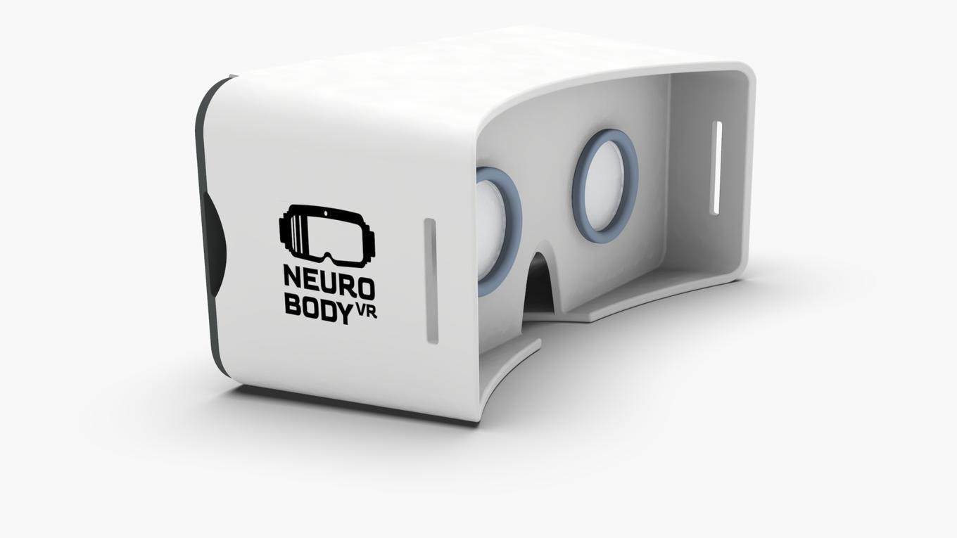
Neuro Body VR
Brand Identity Development Case
Project Overview
Neuro Body VR is a comprehensive brand identity development project for VR Hazid Tech, an Israeli startup introducing a groundbreaking VR device and exo-skeleton system designed for medical treatment and therapeutic rehabilitation. The primary project goal was to develop a complete visual identity and brand language capable of communicating technological innovation, medical credibility, clinical efficacy, and therapeutic benefit to potential investors, healthcare professionals, and stakeholders—ultimately supporting capital investment and market positioning.
The Challenge & Strategic Context
Creating brand identity for emerging medical technology requires careful balance between communicating technological sophistication and maintaining approachability for end users. The core challenge was establishing a visual language that simultaneously conveys cutting-edge innovation and patient-focused healthcare, positioning the product as both trustworthy and forward-thinking. This dual positioning is critical in medical device markets where investors demand proof of innovation while patients require confidence in safety and effectiveness.
Research & Creative Direction
The process began with comprehensive visual research combining contemporary and classical design references. By analyzing medical technology aesthetics, therapeutic design principles, innovation markers, and competitive landscape, we established a detailed mood board reflecting the product's dual nature: advanced technology meeting human healing and rehabilitation. This research phase informed all subsequent creative decisions.

Naming & Brand Strategy
From visual research insights, we developed extensive naming explorations, systematically identifying words, phrases, and combinations that captured the project's essence—merging neuroscience, embodied physical experience, and virtual reality innovation. Each name iteration was evaluated for market positioning strength, international appeal across healthcare markets, emotional resonance with target audiences, and differentiation in the medical device space.


Logo Development & Visual Identity System
The isotype explorations reveal iterative refinement of the brand mark through multiple conceptual directions. Explorations tested geometric precision reflecting technical sophistication, organic forms suggesting biological systems and rehabilitation, and metaphorical representations of neural networks, physical embodiment, and healing. Parallel color exploration tested how palette choices communicated medical authority, technological innovation, therapeutic warmth, and market differentiation.


Brand Application & Complete Execution
Beyond the core logo, the project encompassed comprehensive brand system development including primary and secondary typeface selection—rigorously tested for readability, legibility across applications, and alignment with brand personality. Complete brand guidelines covered real-world applications: website layout and digital presence, marketing collateral for investor presentations, product packaging and labeling, trade show materials, and comprehensive brand standards documentation supporting market launch and investor communication.


